Thursday, 28 April 2011
shot list
Below is the type of shots and transitions we can include in our music video:
Close - up shot - this will show the audience the emotions of the character(s) and allows the audience to try and think how they think and feel in that situation they can try and understand thier emotions.
Close - up shot - this will show the audience the emotions of the character(s) and allows the audience to try and think how they think and feel in that situation they can try and understand thier emotions.
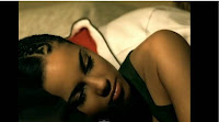 Wide angle shot - allows the audience to see the location of the scene and can gain an idea of the story line and an understanding of what is going on.
Over the shoulder shot - so the audience can see what the character is looking at and can see it from their perspective.
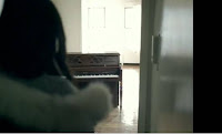 Zoom out and in - this can help to show something important especially when zooming in on something as it is something in particular that is being shown therefore important and the audience can clearly see this.
Cut from shot to shot - this is another transition that we can use especially if the pace of the song becomes quicker the shots can easily be changed from one to another using cut.
Panning - this allows the audience to seem as if they are actually there witnessing what is happening in a chosen scene helping them understand the storyline.
Fade in and out - this usually is a good transition to use between shots that are very simialar to each other or to bring in the first shot/scene at the beginning or fade the last scene out to black at the ending of the music video.
From the music videos that I have analysed all of them have included some of the shots and transitions above which made them effective and mainly helped the audience to understand the story and emotions of characters.
locations
 Graveyard scene where the female character sits next to a grave. This is used to show the audience quite easily that the reason the lead character is crying is that her parent is dead.
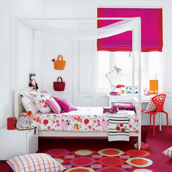 Bedroom scene where the female is looking through photographs of her mother and herself showing that she is thinking of her memories that she has. Thus this allows the video to flow as it tells the audience that the next scenes within the clip are memories.
 The kitchen scene where a memory is shown between the mother and the daughter thus showing how ill she was yet how happy they were.
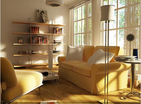 The living room scene where another memory is shown yet this time the mother is shown to be even more ill but putting on a brave face for the daughter. It is also used to have the main character and her mother singing along with the lyrics.
The park scene where the female drops the letter from the book and lets it fall to the floor allowing the viewers to see the letter burn. This shows who died as the letter is signed by the mother thus letting the audience know exactly what happened along with the graveyard scene.
Wednesday, 27 April 2011
Thursday, 7 April 2011
Monday, 4 April 2011
Friday, 25 March 2011
Wednesday, 23 March 2011
Monday, 21 March 2011
Wednesday, 16 March 2011
Questionnaire response
Throughout my Questionnaire i am asking you personal opinion on my MAGAZINE ARTICLE.
(I asked 10 respondents their overview on my ideas and what they thought.)
Question one -
Does this magazine article fit the genre of the track?
Yes No
Response - Everyone who i asked responded to NO. No-one responded to yes which means my target audience wouldnt purchase this single because the article i have produced doesnt fit the track.
Question two -
Does this article fit the genre of the magazine itself (SUGAR)?
Yes No
Response - Everyone you answered said NO , asked then asked them why to get more details and every respondent said it was looked like a rock article instead on the original response.
Question three -
What would improve this article? please state one option.
........................................................................
Response - There was a few different responses for this question but everyone stated that it needed to be a lot lighter as the colours are to harsh for the genre. One respondent said they wont to see more photo's rather than text as it is away of drawing in attention and people tend to view the photographs instead of the text.
Question 4 -
Would you purchase this single through the article you have seen?
Yes No
Response - Overall most of my respondents said NO because it gives a false view on Carly and her genre of music.
Question Five -
If chosen No please state why!
.......................................................................
Response - The response for this question was pretty much the same throughout as they stated it gave a false view and did not fit the genre.
Thank you for taking part in this questionnaire.
An overall look at my responses is that i need to drastically change the design as it gives a false view on the artist. So i need to make my article more upbeat and interesting to fit in with the magazine. Have more photo's will also allow me to draw in more of a wider audience because people will look directly at the photographs.
Questionnaires
Throughout my Questionnaire i am asking you personal opinion on my MAGAZINE ARTICLE.
Question one -
Does this magazine article fit the genre of the track?
Yes No
Question two -
Does this article fit the genre of the magazine itself (SUGAR)?
Yes No
Question three -
What would improve this article? please state one option.
........................................................................
Question 4 -
Would you purchase this single through the article you have seen?
Yes No
Question Five -
If chosen No please state why!
.......................................................................
Thank you for taking part in this questionnaire.
Monday, 14 March 2011
Target Audience


I have chosen to place my dijipak advertisement into SUGAR because our target audience is aimed at young females. Statistics show that 113,320 young girls in Britain purchase the magazine monthly. However it has fluctuated over the years to when its first issue came out in October 1994 when the monthly rates where at 205,000. As you can see the monthly rates have dropped throughout the years however many young girls still buy the magazine to catch up with the gossip and new style techniques. Having Carly's Dijipak advertisement within this magazine will allow it to catch the target audience eye's and allows them to connect with her genre of music. I have chosen to use SUGAR because it help promotes our DIJIPAK because of the audience of the magazine. Carly fits into this magazine because the obvious point she is female and secondly its is a fairly big age range from 13 - 17 year old. My initial idea for my Magazine article doesn't fit in with this magazine as it is dull and not very girly is doesn't allow Carly to fit into the genre of this magazine. So when recreating my magazine article i need to have in mind how it is going to fit in and how it is going to be presented.
 This magazine article is just an example due to the fact i had some technical difficulties and i ran out of time to edit it. I had trouble re-sizing the photo's , to make them bigger they were pixerlated and stretched. This is just the base of the magazine article. However from a personal point of view i am very unsatisfied with the outcome because it doesnt fit with Carly's target audience. S0 my next step is to re-create my magazine article to fit in with the target audience.
Wednesday, 9 February 2011
ANOTHER IDEA .....
Monday, 7 February 2011
Response ....
I only asked one question through my survey towards my target audience " YOUNG ADULTS"
1. What genre of music would you apply to this DijiPak design to?
Many people said that the picture of Carly with the lyrics over took the seriousness away from the Single. They said i looked mature and appealing with the scenery as the cover because it draws you in.
Other response was that people loved the front cover but needed to know the title on it. They also said they didn't like the photograph with lyrics because it made the Cd genre look very rock and very unrealistic.
Analyses-
Looking through the response from the Questionnaire's the response has shown that the pages that where originally going to be the inside page should go on the front and back page because it shows the formality and the emotion shared in the music video. I asked 10 members of the audience which creates a big problem as it is not representative. This creates a problem because it doesn't tell me what other members of the audience think, it only tells me what them 10 respondents think. However the audience could have been extremely biased because they where relatives to me. This could initially create a problem because they may not say what they really think. However looking at my results i have decided to stick with my audience's idea because it is allowing them to have a connection with the work and is away of promoting the single.
Friday, 4 February 2011
Target audience ...

 TARGET AUDIENCE ...
- Adelle's target audience is defiantly aimed at young adults, i have came to this conclusion because the song has very emotive words and has a story line to adapt to.
- The Dijipak could portray the idea of the MALE GAZE because the way in which Adele is positioned and the pose she is expressing.
- More females would connect with this song because of the story line. Many females are able to connect with the emotions that is being portrayed.
- However many adults may enjoy listening to this song because it is calm and gentle song. With a soft nature the music will invite more of a greater audience and a greater age Barrera.
- My overall conclusion is that Adele;s target audience is aimed at the same audience as my music video because of the emotion and setting of the video.
Analysis of Dijipak .....

Adele - Make you feel my love
This Dijipak single shows the gracefulness and emotions behind this particular single. Through this cover you can understand the emotion behind the song, by this i mean she has a sorrowful and deep emotion within her facial expressions. This shows the audience that her song has a connection with her and it allows the audience to have a better understanding of Adele and the lyrics she has created.
Having The artist herself on the front of the Dijipak it is selling the artist and promoting her style. So not only is the Cd promoting The single but it is also promoting the artist herself. The way in which Adele is positioned again has a dramatic connection with the audience. This is because Adele is looking directly into the audience eyes allowing the audience to have a deeper and more emotive connection.
I have taken the idea of promoting my artist by having her positioned on the centre of the Dijipak, this is selling my artist and her song. On the front of Adele's Dijipak underneath her name she has the song title hand written, this is showing the audience the independence and individuality that she is trying to show.
The emotion of the song connects with the songs as it is sorrowful, this is shown in Adele facial expressions and posture. I have taken the idea of connecting the Dijipak with the song, so i decided to turn the image black and white and increase the contrast to allow the image to have a negative emotion. I have then written all the lyrics over the front of the picture and then highlighted the titles, this makes the Dijipak for individual and Will stand out to the audience.
I have chosen to view this Dijipak because her song shares the negative emotions that my music video shares and allows the audience to connect with the situation, by this i mean the situations that the music video is placed in will have a particular meaning to members of the audience, by this i mean they may have experienced the emotion or be going through it.
Subscribe to:
Comments (Atom)


